Sensee. Opticals new store concept
We all dream about those glasses which give us a positive and transparent vision of the future…
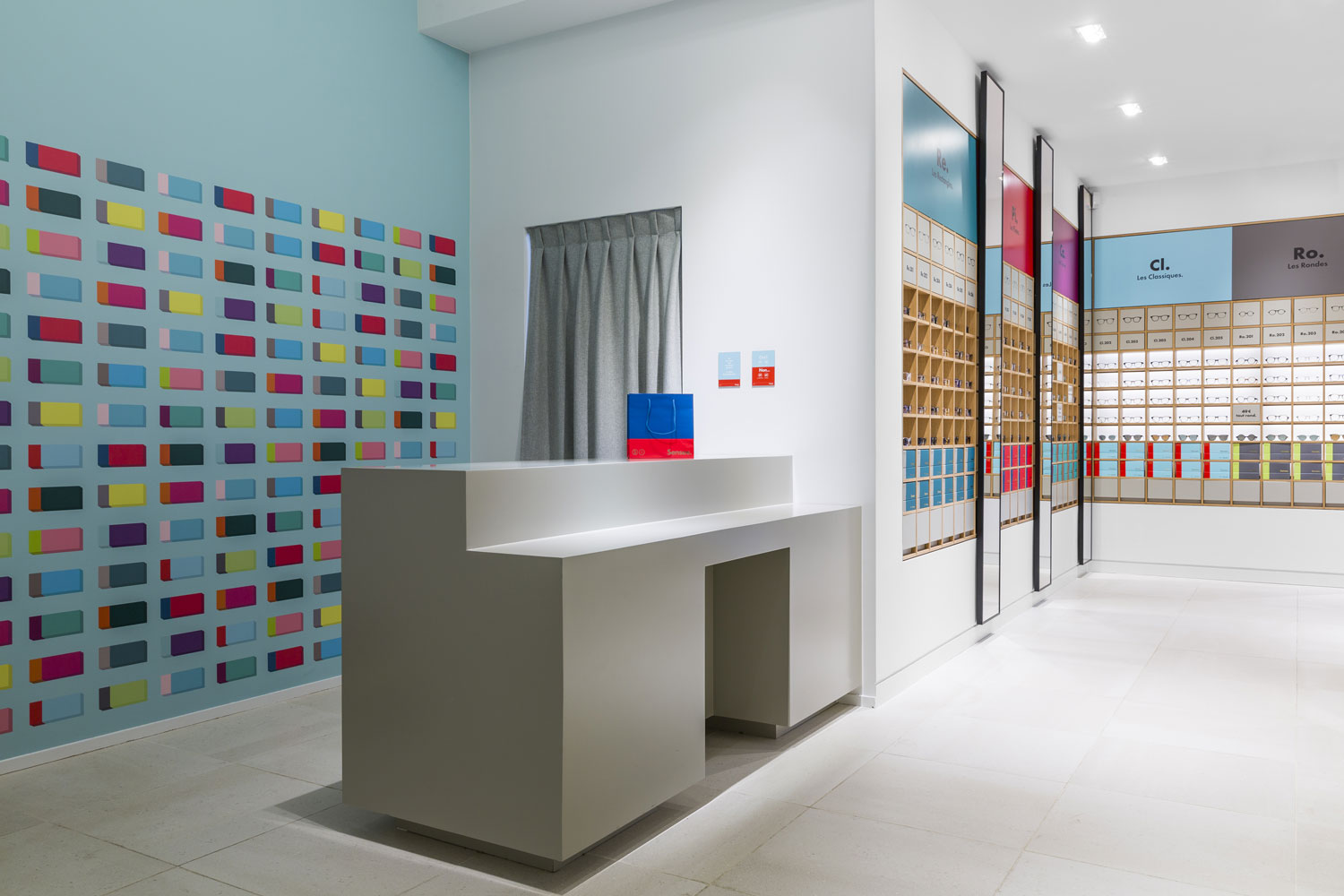
Sensee, glasses brand built by Marc Simoncini, asked to Le studio REV to create the concept of its first stores, based on the new positioning of the brand and its very first collection (designed, produced in France and delivered by Sensee).
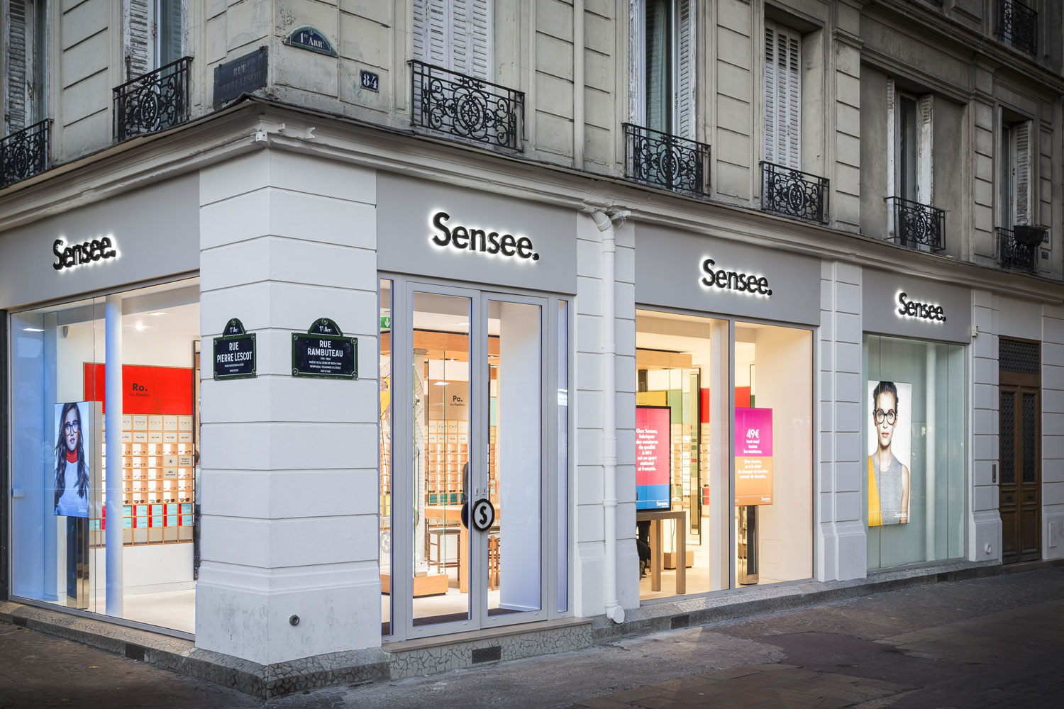
Sensee choose to settle down, in October 2015, its first Parisian address in the heart of the capital, 84 Rambuteau street (75 001 Paris) in the booming Halles neighborhood, area in urban transformation. The second shop opened at the end of November in Marseille.
Working on a singular object as glasses, real extension of our personal image, is a big challenge, both as technical and aesthetic. No ornement, wedges, white glossy background, chaotic and undifferentiated accumulations…
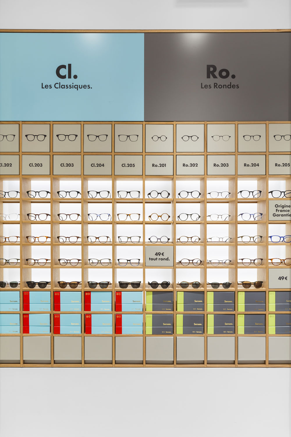
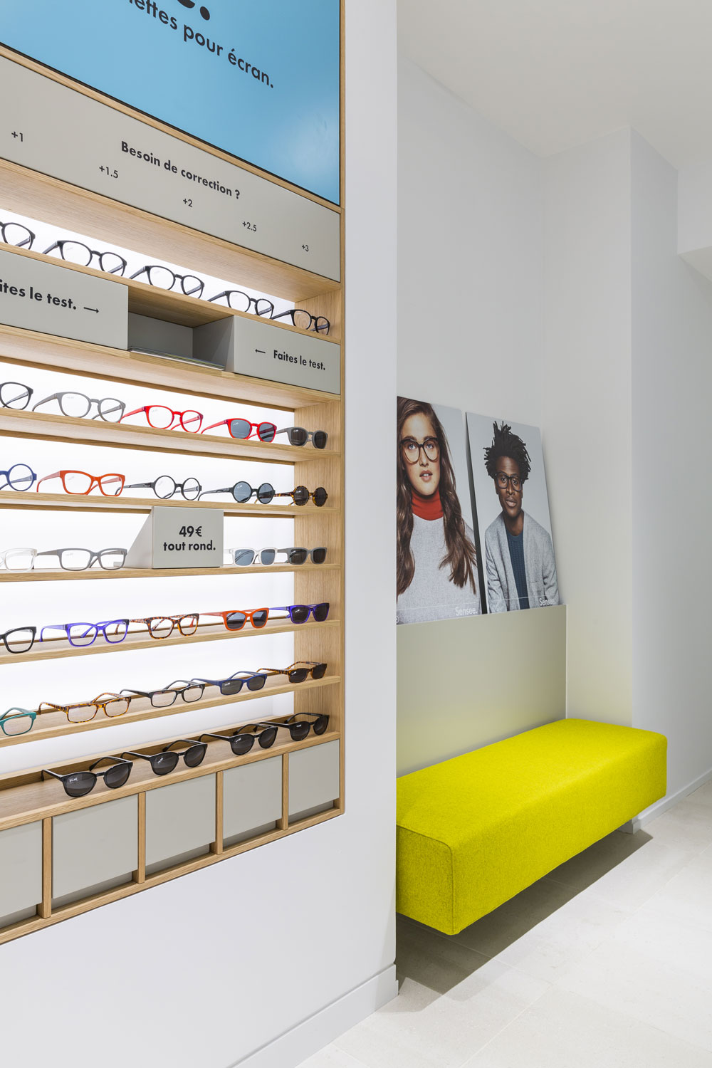
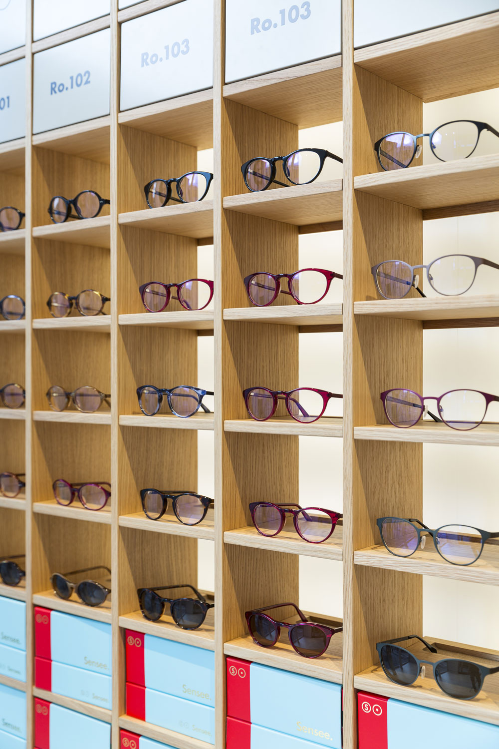
Our main goal is to generate an emotion sustained by the purpose object, the glasses : everything is done not only to show them, but to reveal them.
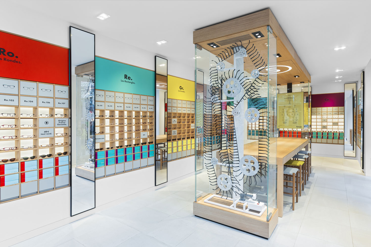
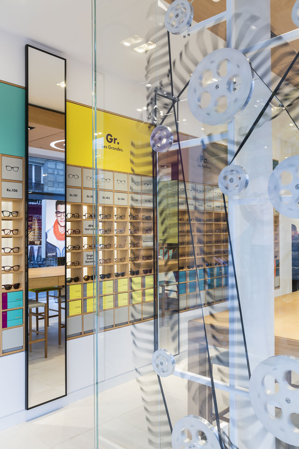
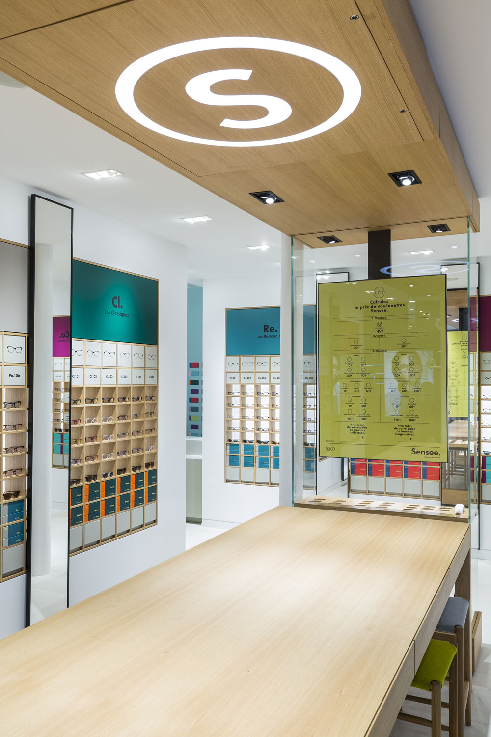
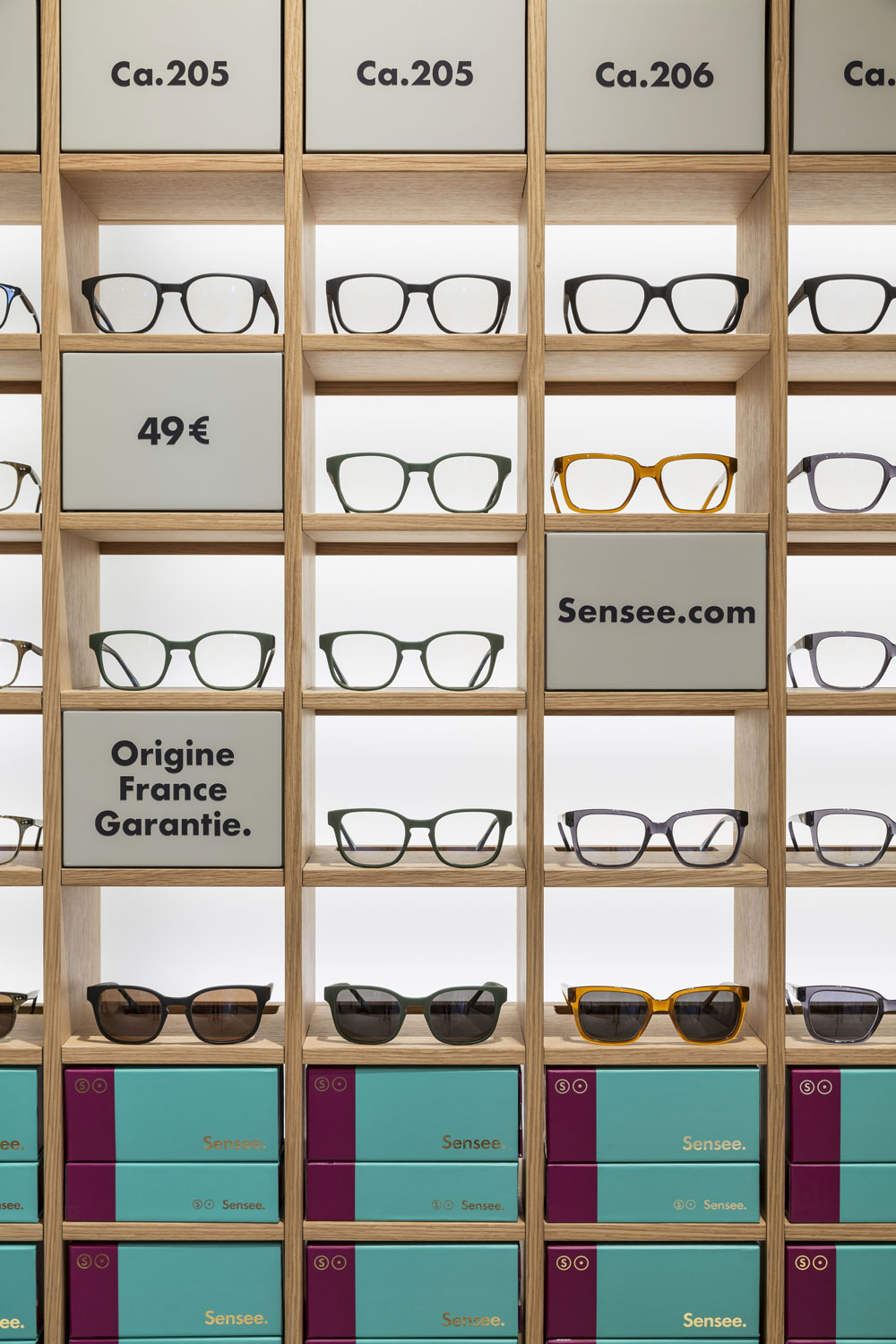
Individual boxes with a specific lighting house and emphasize each frame, each family form.
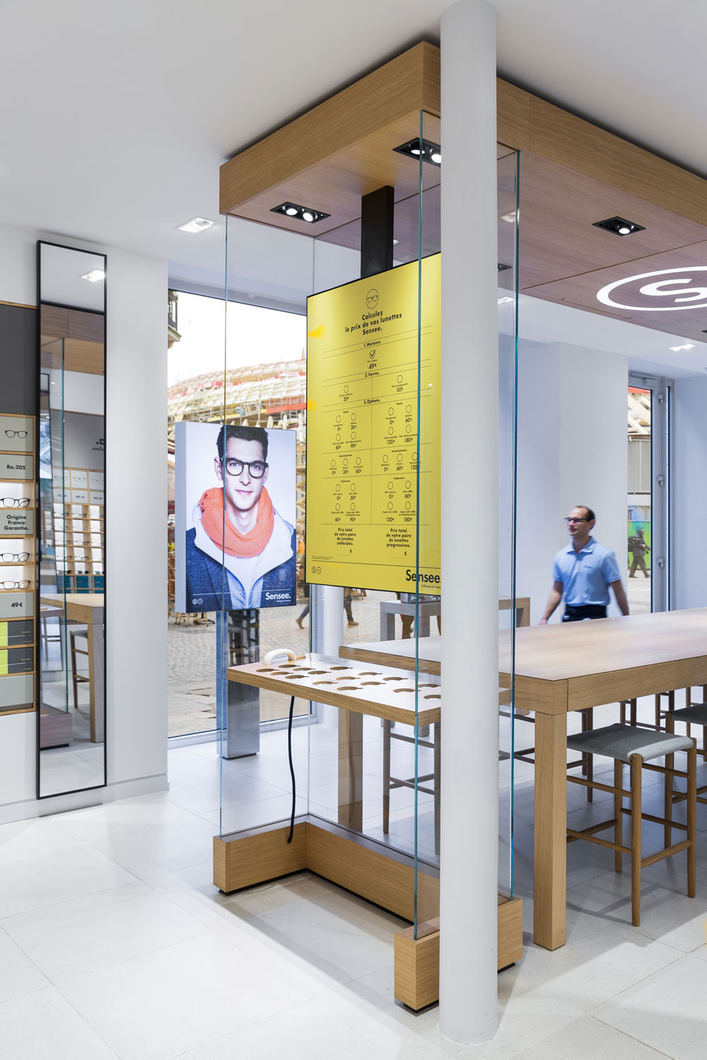
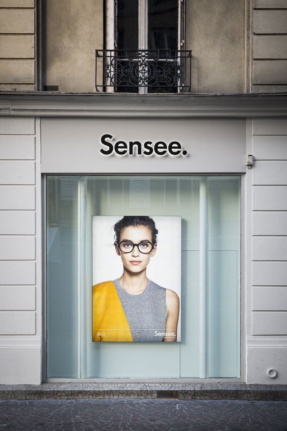
To accentuate the visibility of the shops and give them an identity in the heart of the city, by day and night, the façade erase herself to reveal the iconic element that we have created for each retail space : the Sensee box.
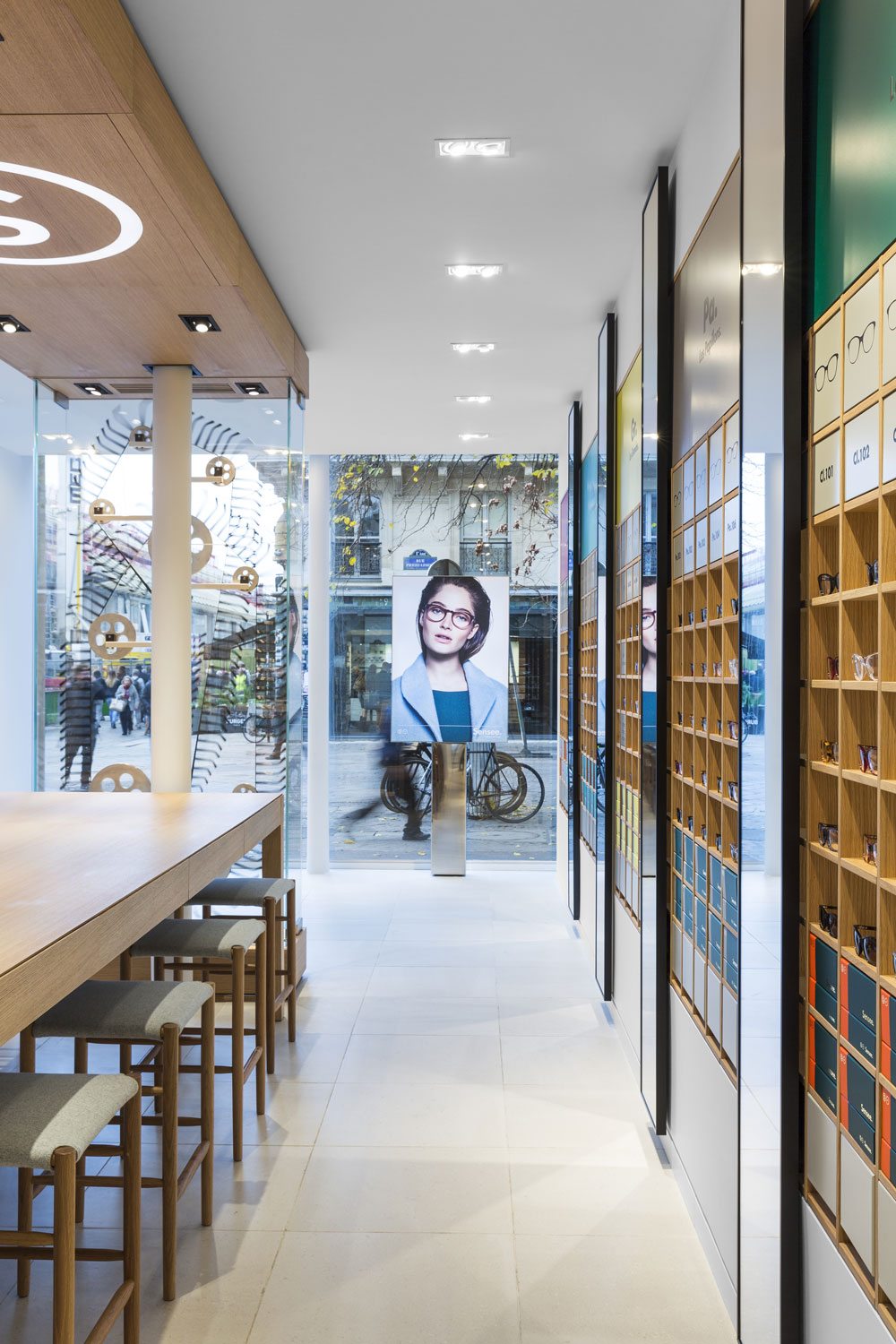
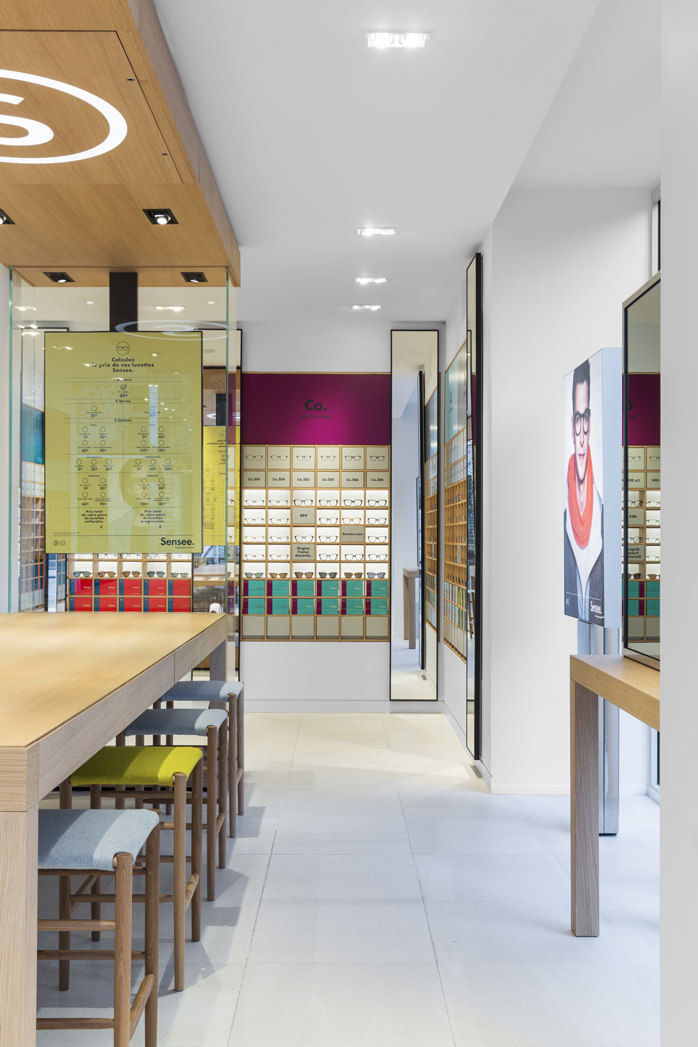
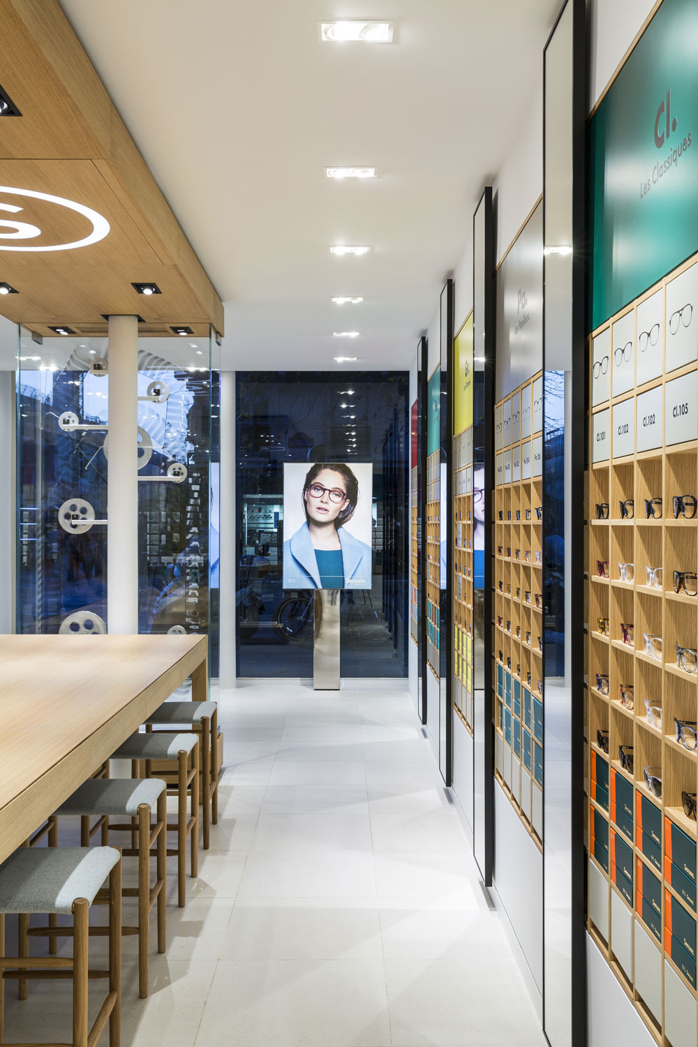
This feature is symbolic and functional at the same time : a big table allows the clients and the Sensee ambassadors to share the visibility on the whole collection, in full transparency and conviviality.
The Sensee box is an emotion catalyst, the singular point of view on the brand and the collection. Here, Sensee’s identity plays with art. Artists are invited to invest the space of an interior display to interpret the spirit of the brand.
The visibility of this iconic display in front of the entrance tend to erase and fluidify the transition between the interior and the exterior of the store.
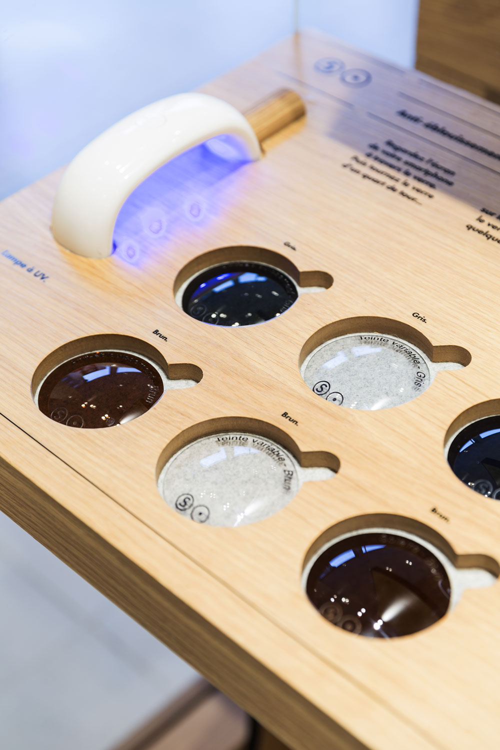
Warm and sustainable materials had been chosen in harmony with the new colorfull graphic identity created by the Be-Poles agency : brushed oak, colored felt etc.
In brief, a clear modernity, affirmation of today’s desires, able to attract and generate among clients a feeling of belonging, the envy to come and come again.
